A Fresh Look at the CuliNEX Brand
Since 2005, we’ve pioneered clean label and plant-based products for food companies of all sizes. That’s nearly two decades of fulfilling our mission of bringing healthier products to market, and nearly two decades of getting really good at solving formulation challenges using whole and natural ingredients. CuliNEX focused on “clean label before “clean label” was even a thing! Back in the beginning, our business cards said we specialized in “natural and organic foods.”
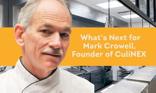
Mark Crowell, founder and CEO tells us, “When I first launched CuliNEX, my industry friends asked me if I was going to be able to make a living with such a narrow focus! Now it’s hard to find a company that isn’t making (or trying to make), clean label products. The market has grown beyond my wildest expectations, and we’ve been truly fortunate to grow along with it.
Today, we are taking a giant step forward by refreshing our brand and launching the next phase of our evolution at CuliNEX. Read the full Press Release.
With this brand refresh we are excited to announce a recommitment to our founding principles by taking a more active role in the conversation about our food systems and what is required to design better foods to support a healthier people. After 17 years, we’re proud of what we’ve built, but equally excited for what the future will bring.“
Mark talks further about the CuliNEX story in this short video.
The Design Story
We know every logo has some high-minded back story. We’d be remiss not to share ours (plus we’d disappoint our graphic designer.) Our new logo uses lower- and upper-case fonts to represent the partnership of our culinary craft and our pursuit of “what’s next” in food science and technology. And every color in our palette speaks to key pillars of excellence that our clients rely on us for. They are the five ideals that set us apart from others.
- Thought Leadership (blue)
- Devotion to Science (orange)
- Plant Based Technology (green)
- People and Connections (light green)
- Culinary (charcoal)

Our Fika Culture
The new logo and colors are also motivated by a crisp Scandinavian design ethic, inspired by fika; what the Swedes call their coffee break. Since we are based in Seattle, arguably the heart of the coffee universe, we love a good brew. It was only natural that we would want to enjoy a cup of joe with one another each day. That desire led to setting time aside each morning to just stop and connect with each other. No phones. No shop talk. Just time to hang out with one another.

“I never thought fika would become an expression of our entire culture!” says Mark. “It’s literally become a verb in the office. Fika keeps us connected and now extends beyond our own team. Even clients and strategic partners know working with us somehow feels different. We love what we do and appreciate the talented people we get to do it with. That shows in ways large and small.”
With this fresh, new look, we will continue to deliver big ideas and solutions, from innovation all the way through to commercialization, with our focus on product feasibility, ensuring a successful outcome. And as always, we remain fierce advocates for the clean label foundation of our work.
To connect with our team, reach out for a fika chat. Let’s see what we can put together.